I recently had the opportunity to travel to San Francisco to learn about what progressive technology companies are doing with office design. While there, I had the good fortune to also visit the brand new Gensler-designed offices of labor and employment law firm, Littler Mendelson. It was a fantastic experience as Littler proved to be on the cutting edge of space design and utilization for American law firms.
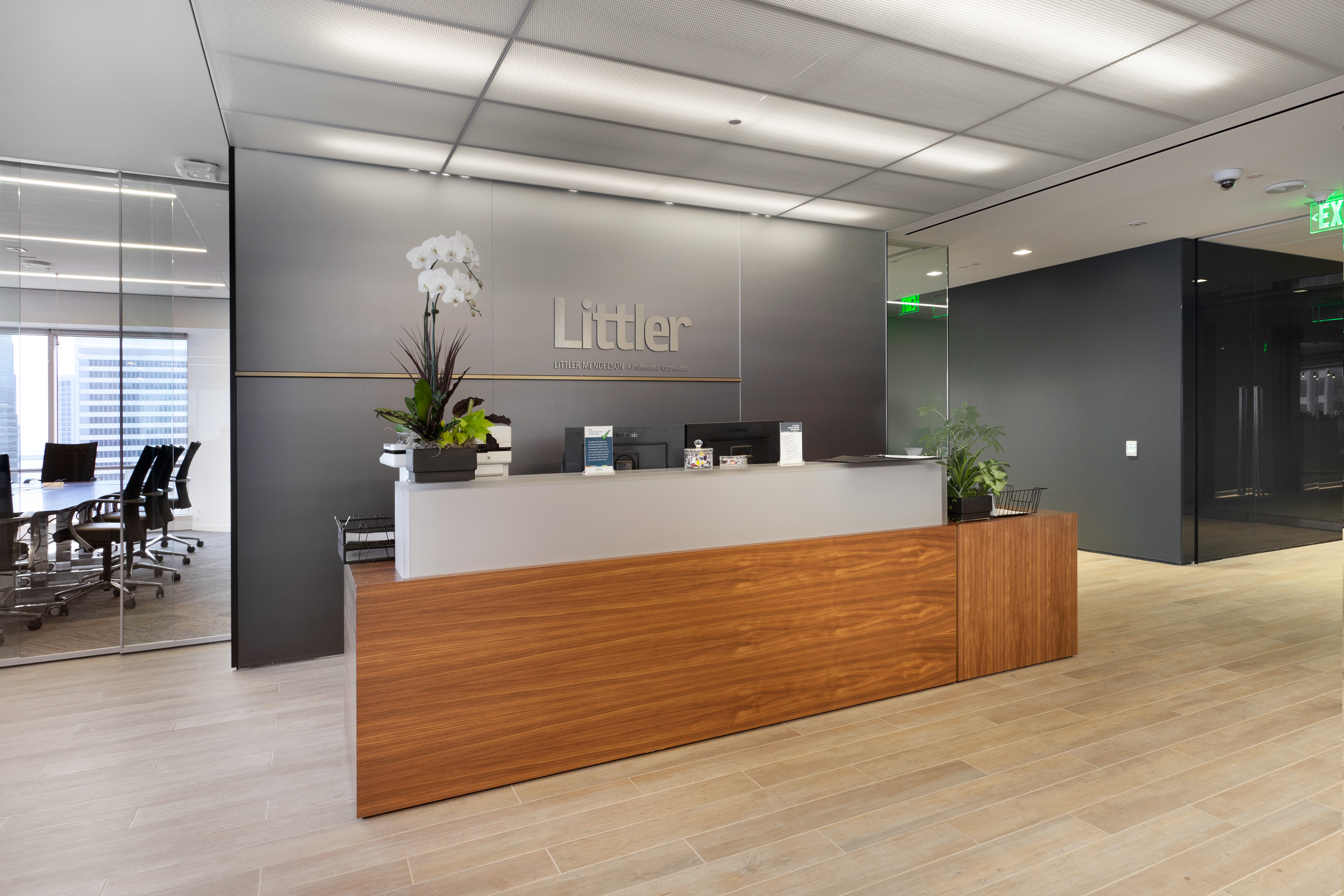
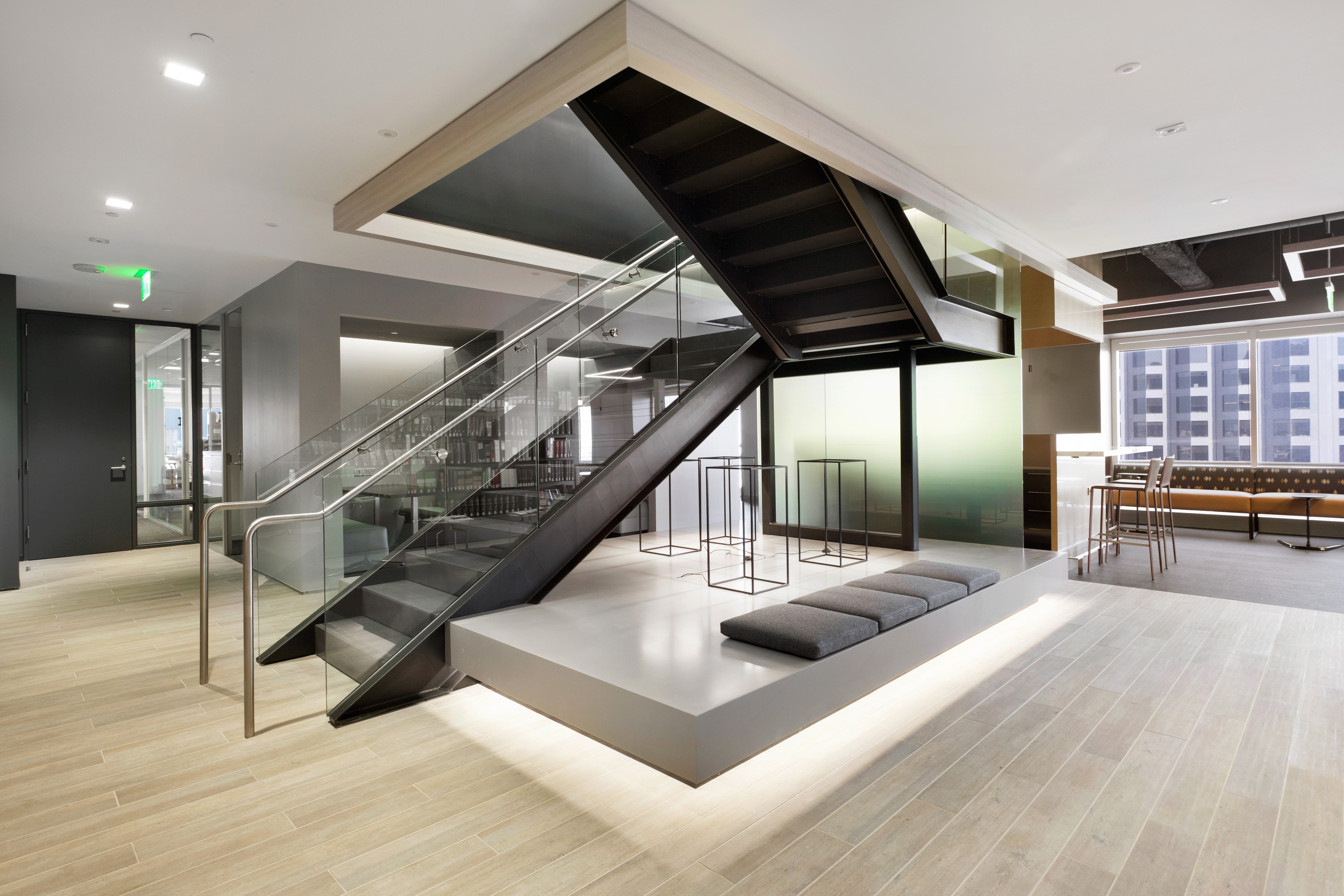 Walking into Littler’s office, the aesthetic is spa-like and calm. Warm natural woods, soft lighting and subtle earth tones are used throughout the lobby. There is abundant and varied seating – everything from high tables to comfortable window seats. On one side of the lobby, there is a large reconfigurable conference room with a collapsible glass wall so that it can be opened up to the lobby for client events.
Because Littler’s San Francisco office occupies two floors, the firm installed an interior staircase to encourage travel between the floors. The staircase was designed as a focal point of the lobby area and opens on the floor below to the firm “library” and the employee lounge/kitchen/break area. The office administrator said that the intention was to be able to use both floors together to host client events.
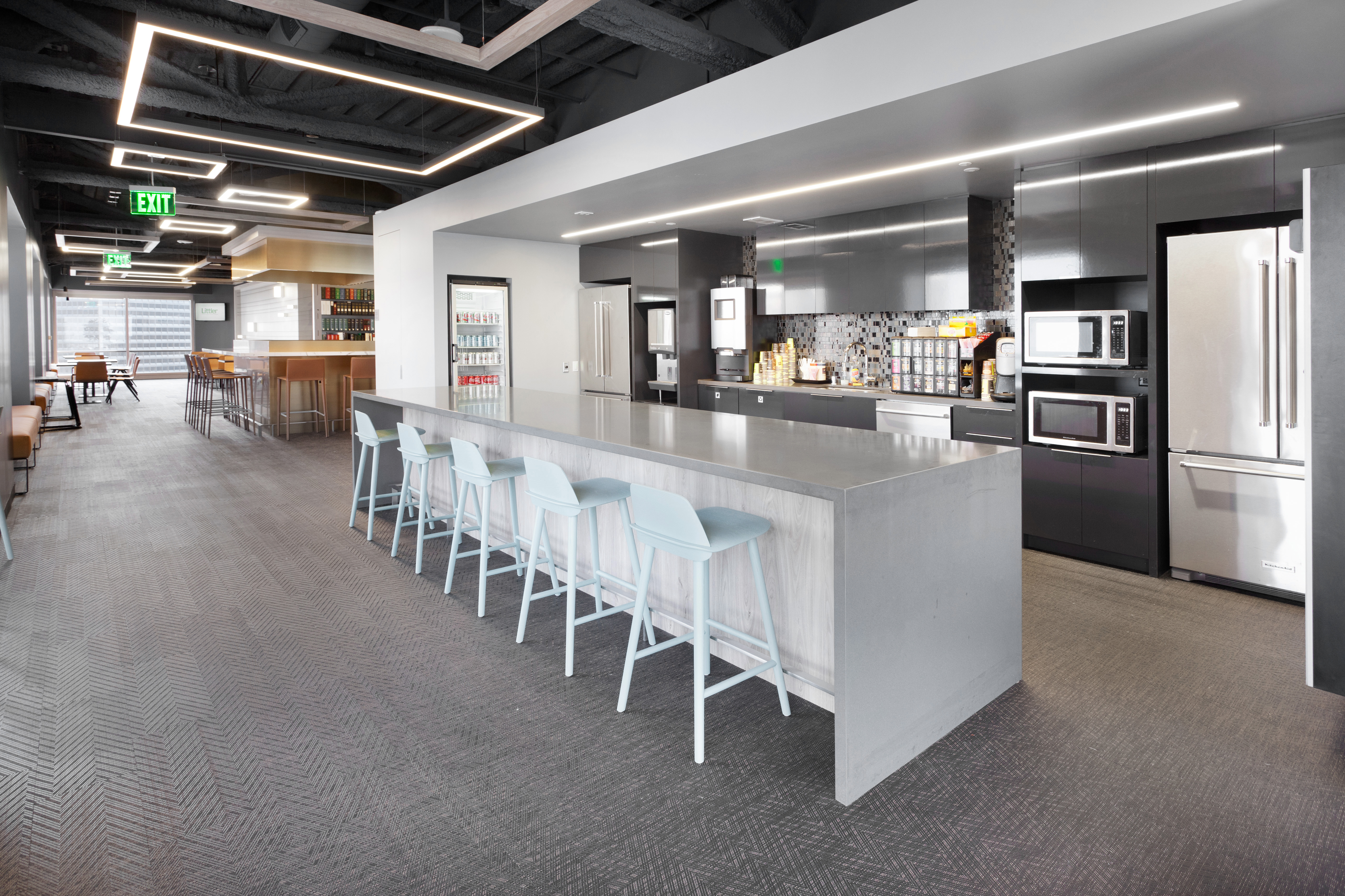
Because they wanted the employee break area to be well-utilized, Littler placed it on the building corner so that two full sides were floor to ceiling windows. The space also features a full kitchen with vending machines and a high-end espresso maker.
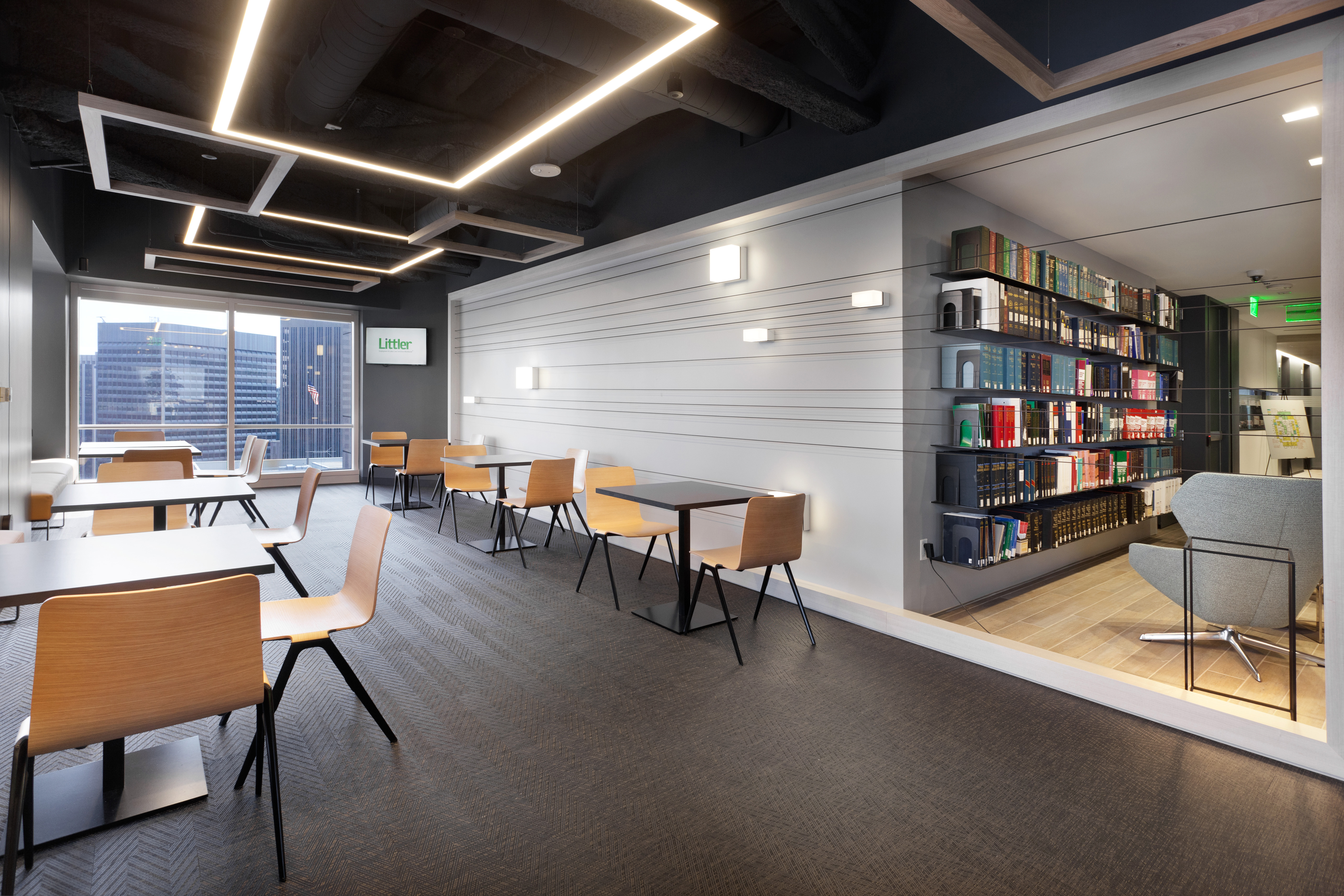
 Recently, Littler determined they would be better served by consolidating their library services at their headquarters in Kansas City as research is now done almost exclusively on-line. Consequently, the San Francisco library, which is adjacent to the employee break room, consists only of five long floating shelves and two comfortable chairs. Spare, but very inviting
 In the non-public facing areas of its offices, Littler adopted a standard ~120 square foot office for its attorneys. Partners and some associates are in glass-walled offices on the perimeter; some second and third year associates are on the interior but have glass walls so as to have access to daylight from the perimeter; and first year associates are in workstations. Standard built-in furniture makes the offices efficient and functional and saves the firm space. In an effort to encourage paperless offices (or “less paper” offices), each attorney is limited to three file drawers.
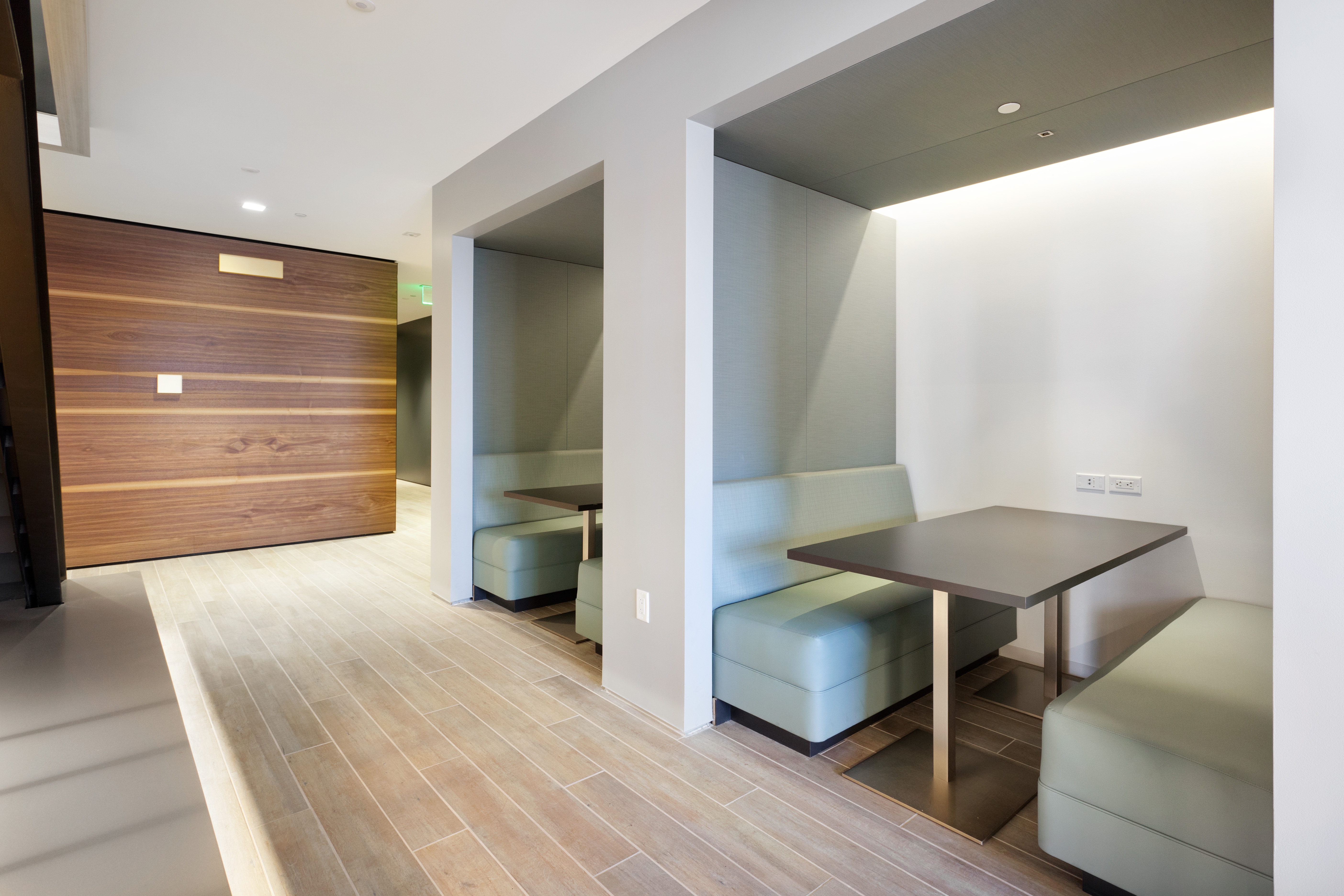
Because attorney offices were not designed to accommodate client visits, there are abundant conference rooms as well as some small hoteling rooms for visiting attorneys. Per the office administrator, the “living room” (designed to make visitors as comfortable as possible especially when in the office for witness or trial prep) is the most in demand conference room in the entire office. Booths are also a very popular destination.
 While they have only been in their new offices for a few months, the response from employees and clients alike has been overwhelmingly positive. And contrary to popular law firm fears, not one attorney has left the firm because their office was smaller and not one law firm grad turned down a Littler offer because they would have to work in a workstation for one year. Instead, the experiment in open and collaborative space seems to be working well.

[…] knowledge with me on the phone or in person. They have set up tours of interesting build outs and accompanied me on those tours to answer my questions. They have helped me get pictures of spaces when my iPhone photos were […]