While in Nashville in January, I imposed on Eakin Partners’ President, Barry Smith, for a tour of his company’s brand new building, 1201 Demonbreun, and I was blown away. Opened on October 27, 2016, the 285,000 square foot tower consists of office, retail and restaurant spaces. After my tour, I also imposed on David Bailey of Hastings Architecture, whose team designed the building, to gain an understanding of the strategy behind the design of the building as well as many of the tenant spaces.
Extensive thought went into the building’s design, starting with curb appeal and views. The office building was master-planned along with the condominiums next door to maximize both buildings’ views of the sunset and downtown and the facades of each building were designed to complement each other. Mullions on the front of the office building facing the street were designed with a horizontal theme while the mullions on the side facing the condominium were designed with a vertical theme to mirror the condominium’s glass and mullions. The condominium building was built on the quieter side of the block while the office building was built with greater visibility to the interstate so that building signage could be optimized.
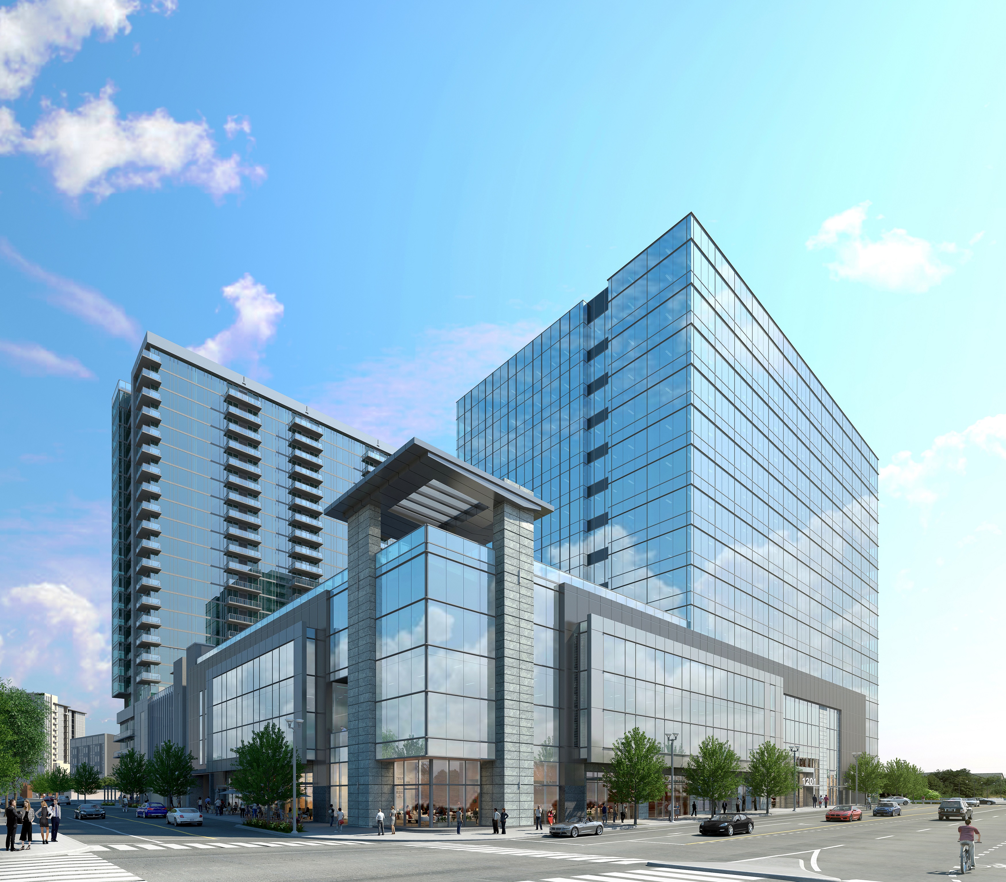 The building (1201 Demonbreun) is 15 stories tall and consists of a large base structure with office, retail and five levels of parking as well as a high-rise office structure that provides ten stories of 26,000 square foot office floorplates on top of the base structure. The office floorplate size of 210’ by 120’ was chosen because it optimizes a five-foot window mullion and offers the thirty-foot bays that are favored by today’s interior planners.
Because the architects and developers wanted the building to be attractive from the street front, the parking deck is wrapped on two sides with office space featuring the same glass walls as the balance of the building. The demands of the parking deck design necessitated that this office space would be 20’ from slab to slab. This ceiling height would allow the second-floor tenant, Brasfield & Gorrie (also the building’s general contractor) to design double height ceilings and include a mezzanine level of workspace.
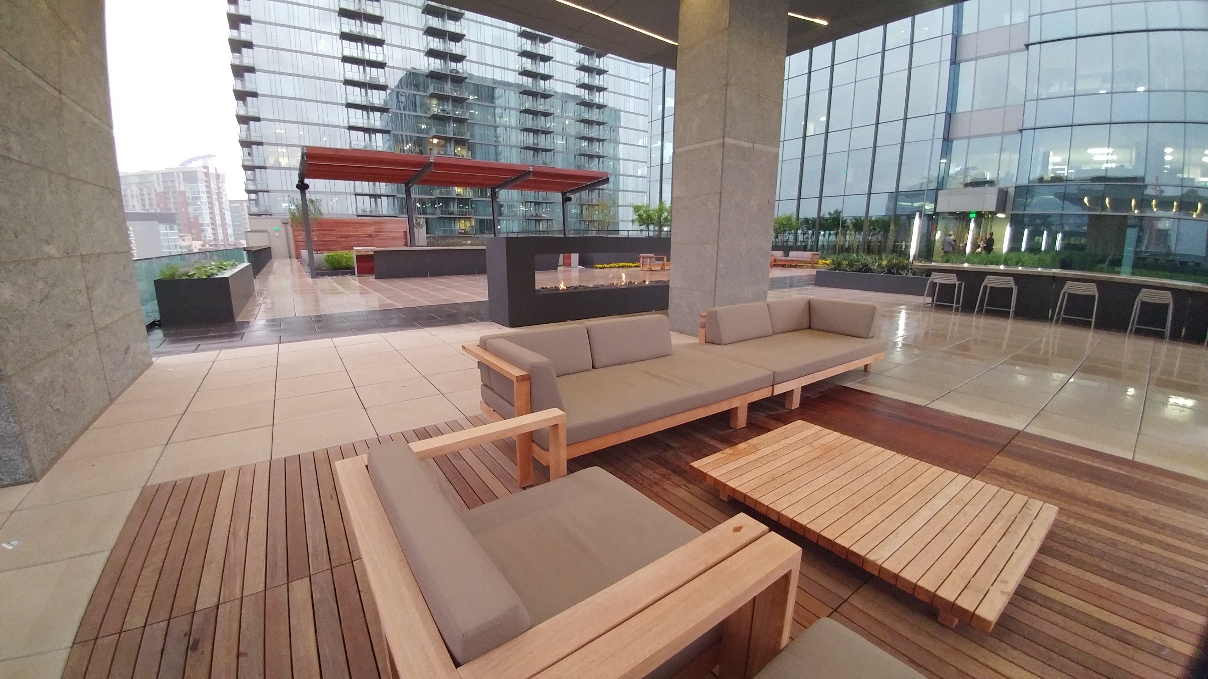
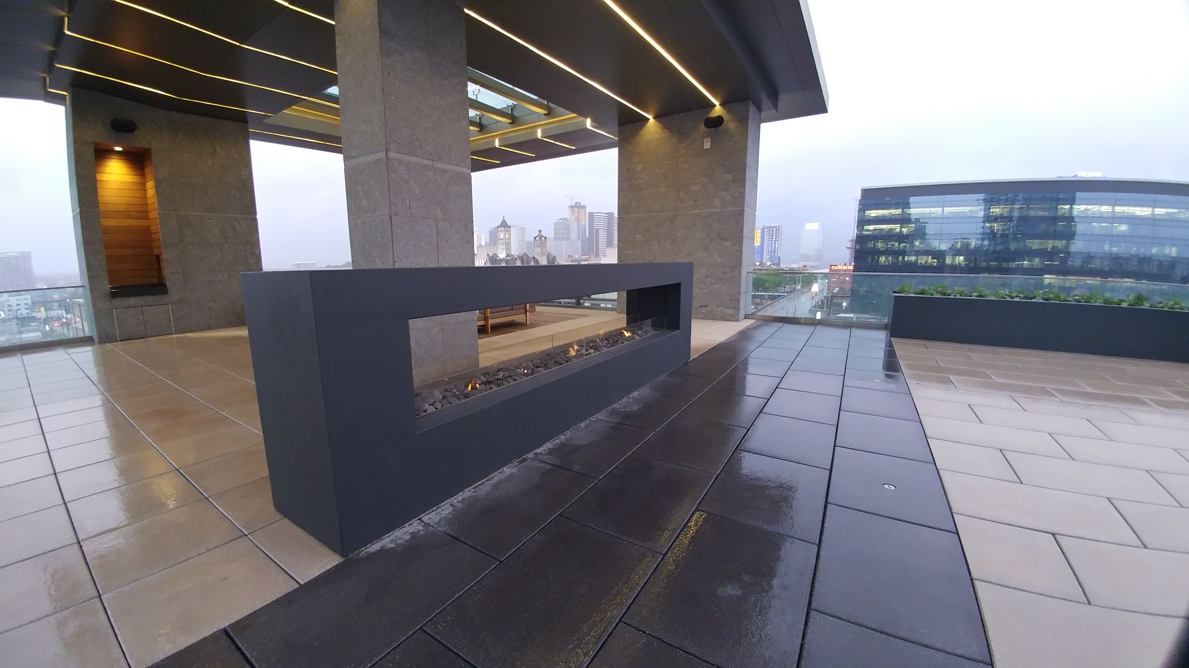
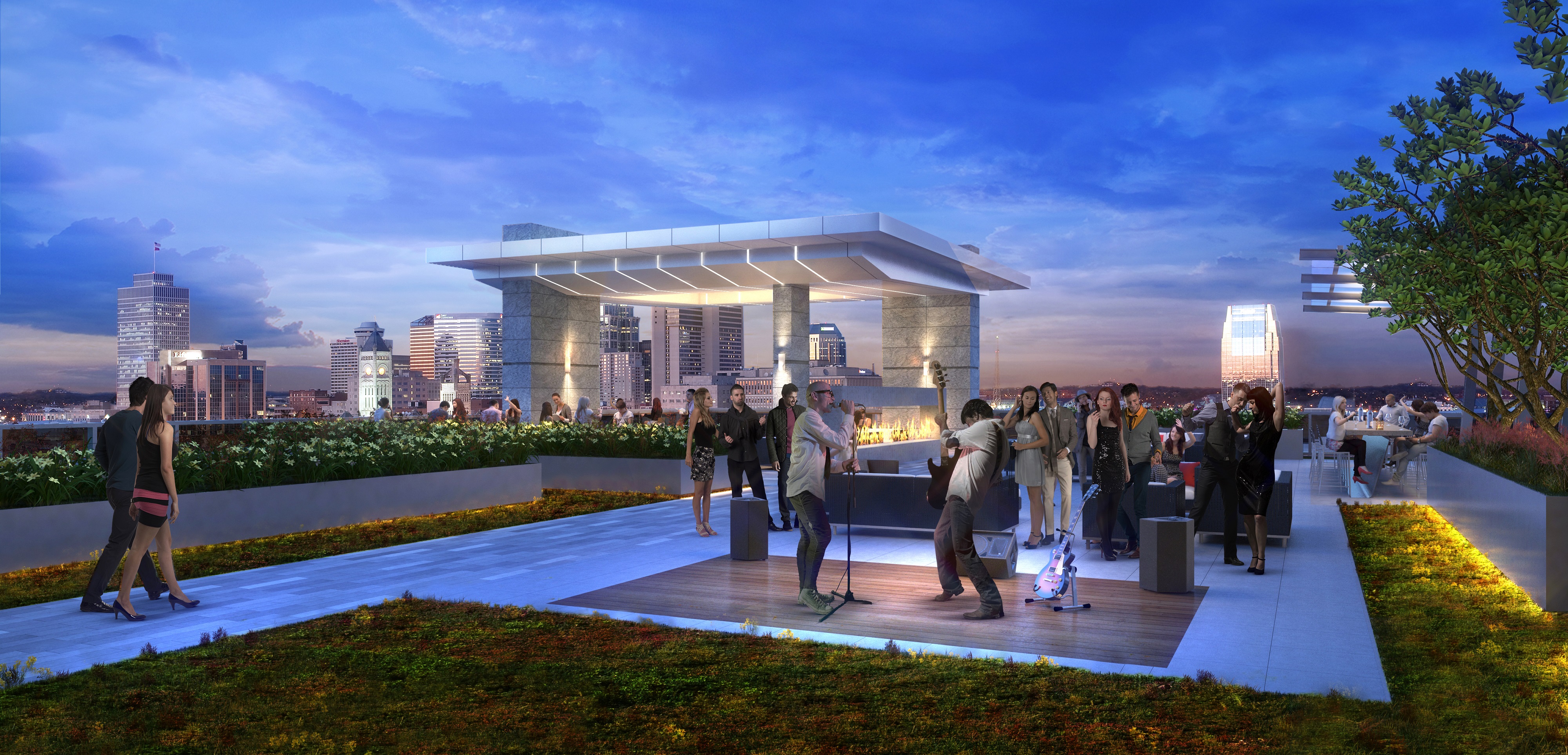
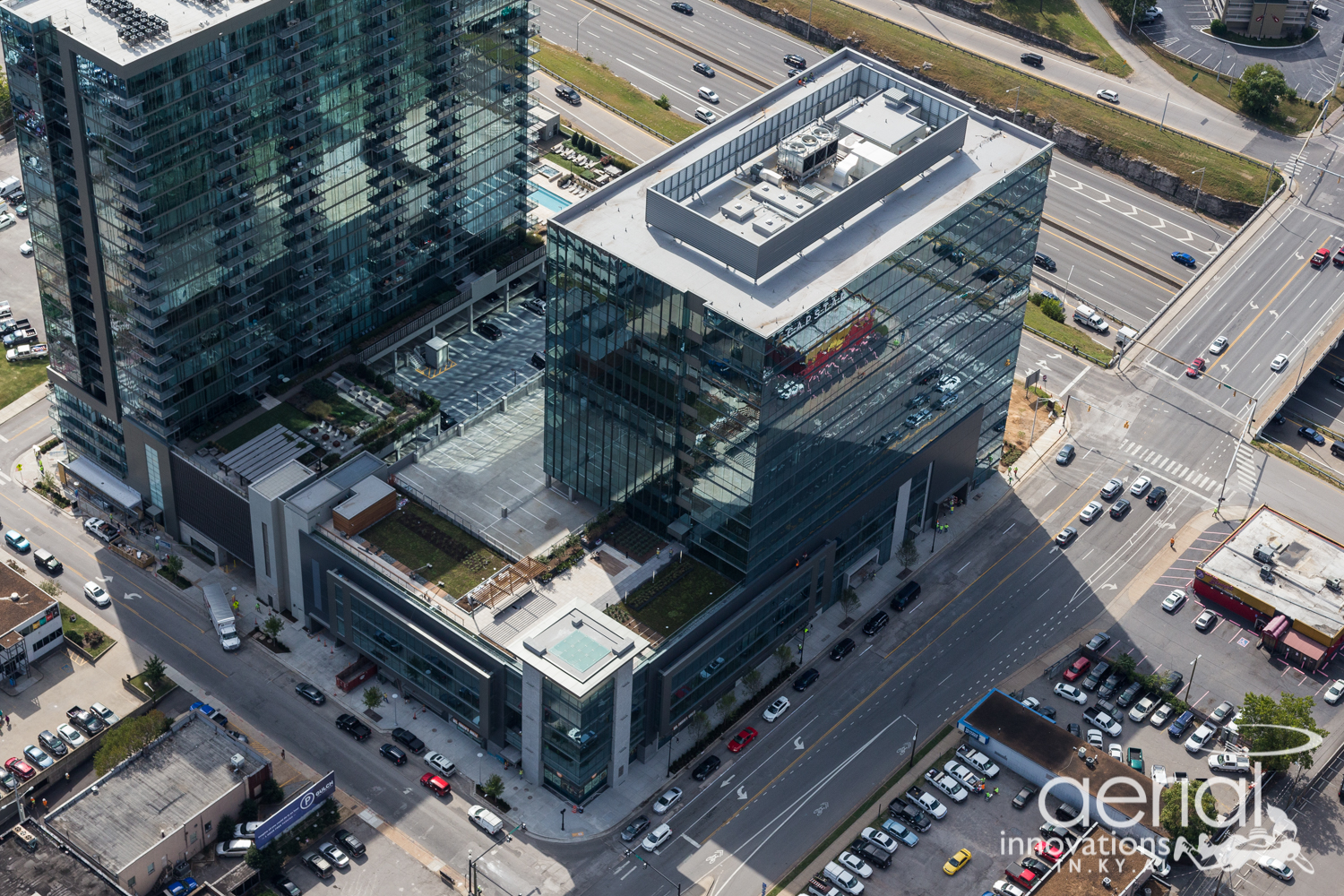 There is a large green roof and terrace atop the parking/base structure on the side of the base building that does not rise into the office tower. This roof deck acts as both an entertainment space for tenants and a destination for building employees year-round. Wired for sound systems for outdoor music events, it features covered space, a built-in bar and a fire pit. Right inside the building, there is a catering kitchen that services events on the deck.
 The building has a LEED silver designation as it reflects a truly integrated approach to sustainable design. As an example, the green roof/deck area captures rain water for irrigation. This benefits the municipal storm water systems. During drier weather, irrigation for the green roof comes from excess condensate water from building systems. High performance window glazing addresses both heat gain and insulation.
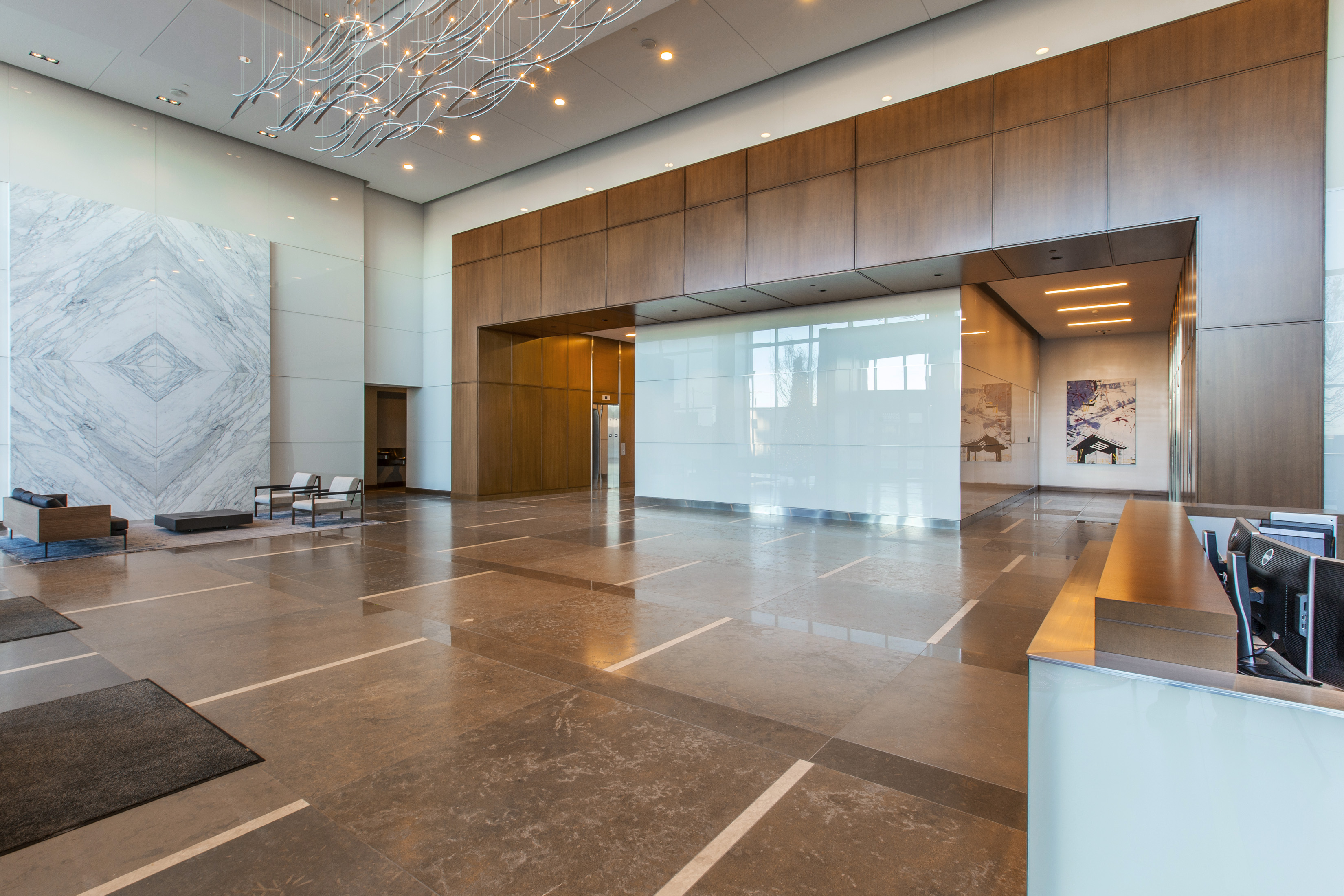
 The main building lobby includes double height walls lined with white Carrera marble and wood millwork for warmth. A ceiling sculpture was commissioned to create movement and reflection and add dimension to the lobby.
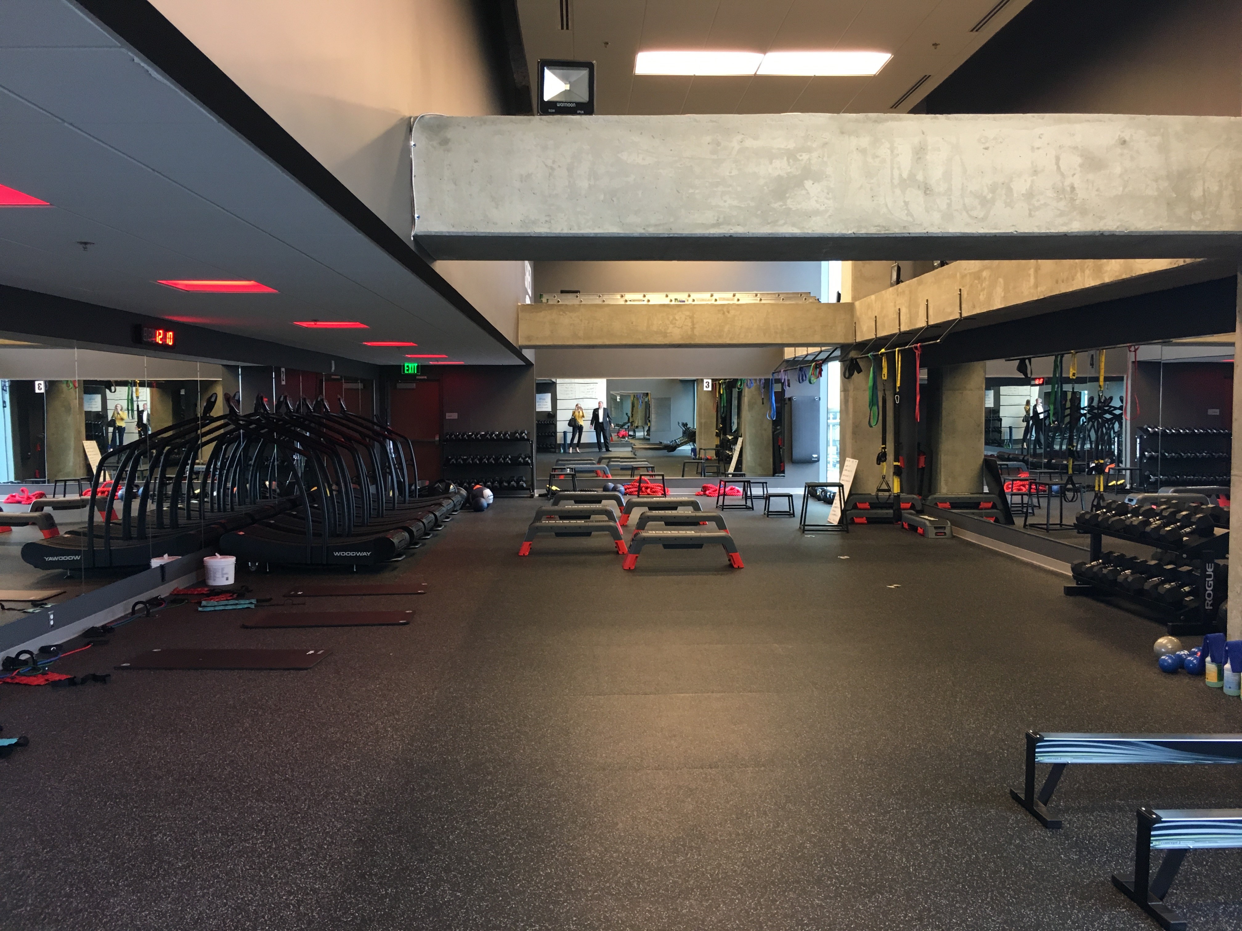
 The building’s owners wanted to offer a fitness amenity to the tenants but did not want to run a fitness center, so they instead offered rent incentives to Shed Fitness to locate in the building. The amenity has been well-received.
 In coming posts, I will share details of the stunning tenant build-outs in the building including William Morris Entertainment, Lendlease, Sony Music and Brasfield & Gorrie. Please subscribe to my website to be notified when they are published!

[…] Australian property development company Lendlease recently leased a floor at 1201 Demonbreun (the coolest new building in Nashville) and Hastings Architecture incorporated biophilia into Lendlease’s workspace to great success. […]